I updated my curriculum after each job interview — Here is what I did, and what you should do too.
In this article, I will go over the three iterations that my curriculum went through during 2019 after researching online and doing job interviews. I will cover the reasoning behind modifications and give pointers so you too can get the most out of your curriculum and make it pop.
Before we dive in, first things first:
STOP USING CHARTS, STARS, PERCENTAGES and any other equivalent to represent your skills in a resume.
I will go into the why later in this article. But I wanted this to be clear. If you take one thing from this article, please let this be it.
Version 1
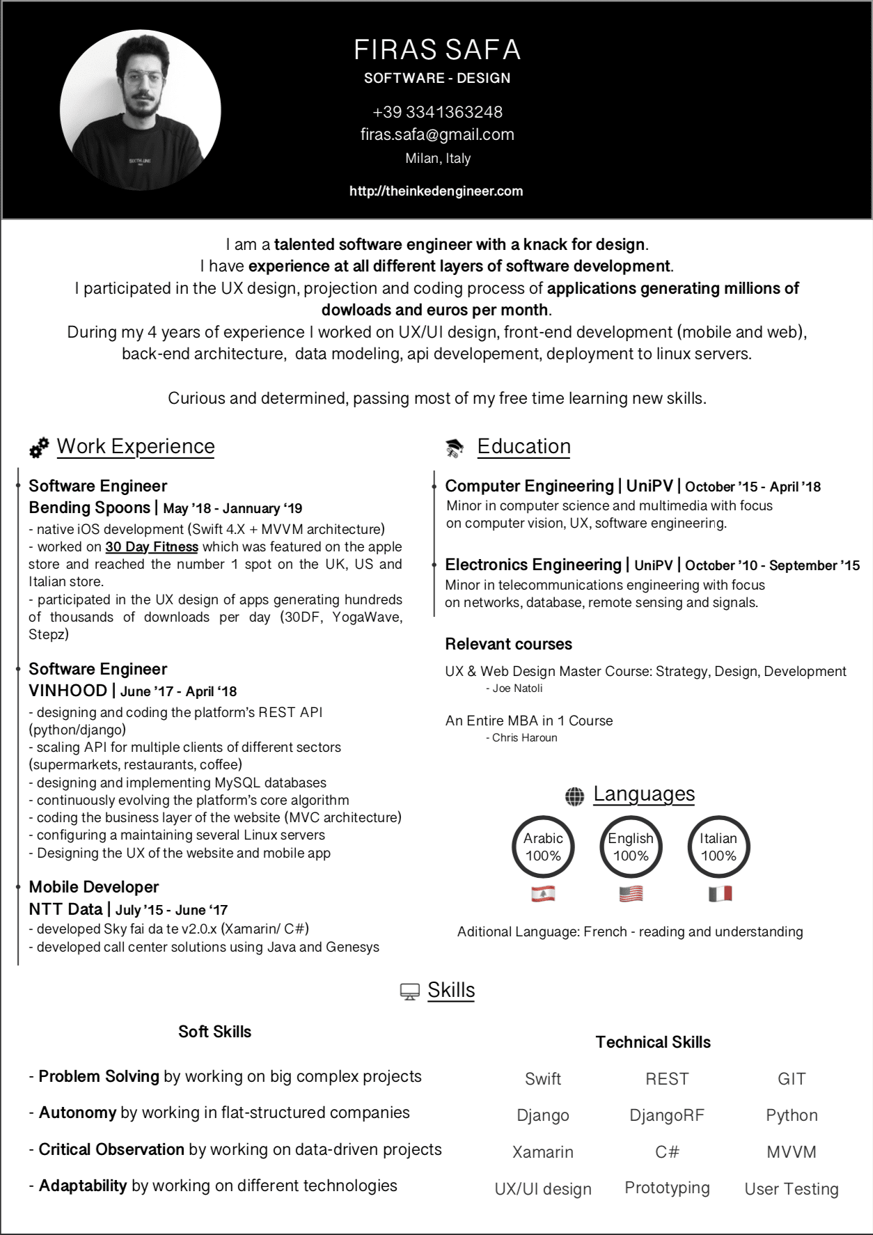
This is the first version of my curriculum. Actually, this design is from December 2017. However, I did update it on the go in January 2019 when I was job hunting. It has everything you expect in a curriculum:
-
Personal Information
-
Work Experience
-
Skills
-
Education
-
Spoken Languages
Layout
The idea behind the layout was the following:
-
Separated personal information from content with the background color switch.
-
Made sure the introduction came at the top so it would be the first thing the hiring manager reads.
-
Work experience, languages and education being equally important (hint: they are not) I tried to separate them vertically.
-
I opted for a visual timeline like line to display the different steps. It was a bad idea, more on this in version 2.
-
Used icons for sections to give it more “life”.
-
Font weight was wrong, titles were not bold whereas subtitles where.
Personal Info
The stuff you’d expect, nothing crazy; name, phone number, email, location, and website.
Introduction
I opted to include a self-introduction. The reasoning behind this is to give an overview of who I am. In my case, I am REALLY into design, even tho I have an engineering background.
Career
The “work experience” section contained the company, my role and the period which are things you’d expect. The important part was to stick to BULLET POINTS when explaining my responsibilities. HR people don’t have all day to read your poetry. Trust me. STICK TO THE POINT. A good habit is to display your work experience in reverse chronological order. I did add what technology or architecture was used in every job to give more context to my bullet points.
Education
At this point in my career (4 years in), courses I took at university are irrelevant so there was no point in pointing them out in detail. I kept it high level and gave a general overview of what I did. I did include relevant courses I did on Udemy, and these did help get callbacks. It’s a positive point when you show that you are willing to dedicate a part of your personal time for your professional growth.
Languages
Yes, I did say STOP USING CHARTS, STARS, PERCENTAGES and any other equivalent to represent your skills in a resume but in my defence,
I learn from my own mistakes. I will be explaining in Version 2 below on why these are useless.
Skills
In this version, I had a list of soft skills. I read somewhere online that including these soft skills on your curriculum can boost your chance of bla bla bla... point is they are useless really. The tech skills are important to mention so the hiring manager can know what to expect from you and what to question you about during the interview.
Though this version is not particularly bad, it is too verbose and too dark. It can be too much for whoever is reading it.
Version 2
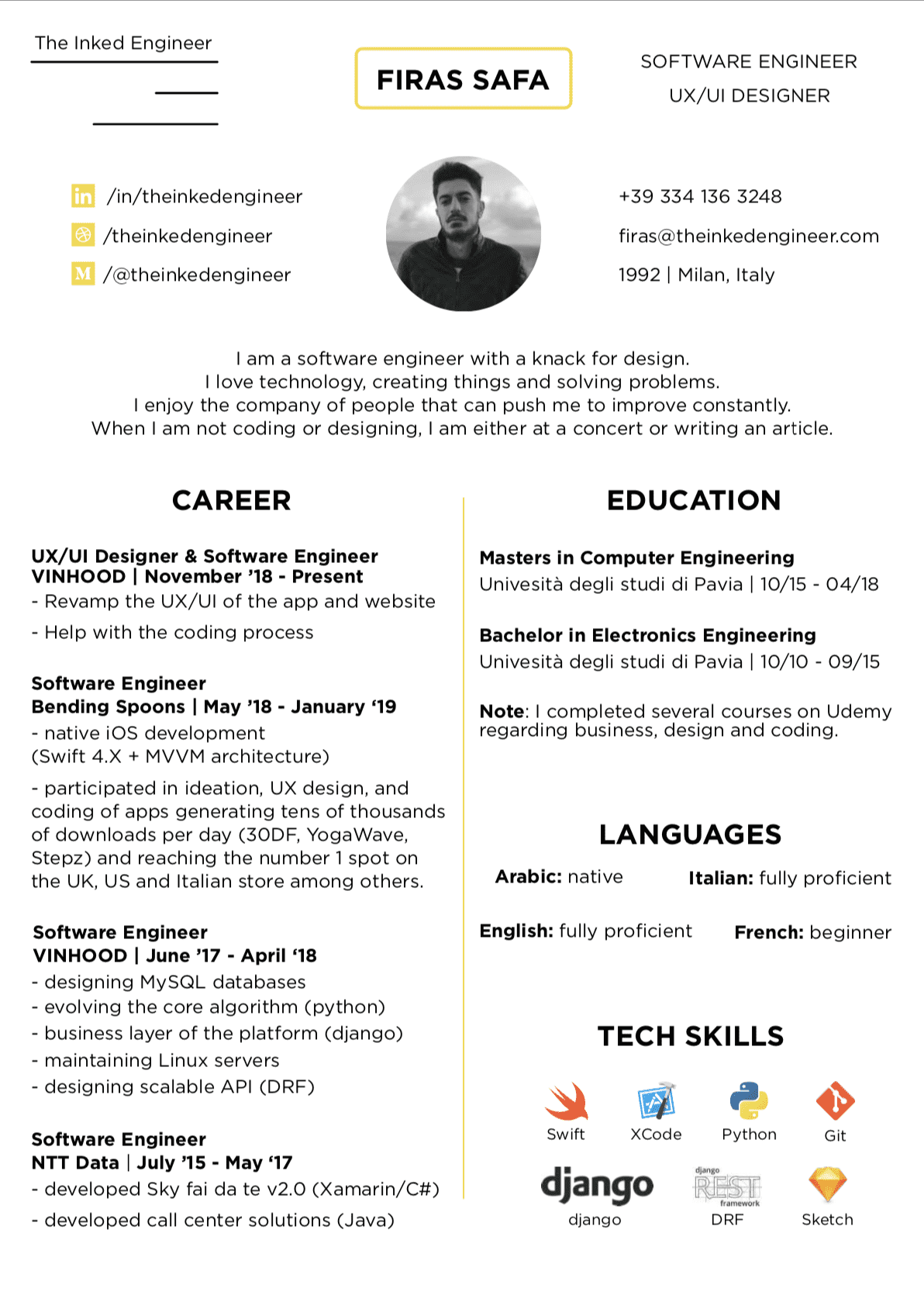
The first thing you notice in this version is that it has more white space, is generally more colourful and more tender or the eyes.
Different sections do pop out more, but later I came to realise that it is still clumsy in the upper part (more on this is version 3).
Layout
-
Got rid of the different background color and used the image to properly divide the parts of the curriculum.
-
Fixed the font weight problem by giving titles a bigger font and by making them bold, too.
-
Introduced a single color that I used as a separator to give the curriculum more life.
-
I did get rid of the “timeline” because it took too much space, and made updating the curriculum a pain in the ass. Every time I moved an item a pixel or two, I had to move the dot as well. Getting rid of it was the smart choice.
-
Removed the bottom section and kept the two vertical sections. I needed the space since I had more work experience now.
Personal Information
This time around, I thought I would add more personal information, such as my medium account to show my blog posts, and my dribbble to show my designs. I got rid of the website because I was not updating it, added my logo since I do want to start my own brand “THEINKEDENGINEER” and went for the more professional email instead of a general gmail email. These steps are not necessary obviously since the curriculum does not serve an end client, but they were nice to have.
Introduction
I kept the introduction but made it less invasive and more straight to the point. It shows my interests, what kind of person I am, and what are my hobbies.
Career
No significant changes.
Education
I thought about it, and since I do not even remember any of the stuff I actually learned I saw no point in mentioning them at all. What is more relevant are the things I actually know how to do.
Skills
I got rid of the soft skills because they seemed to me like a bunch of words thrown around that anyone can just put them on the curriculum. Plus during the interviews I had with that first curriculum, no one seemed to care about them.
As for the technical skills, I skimmed them down to the ones that are relevant and the ones I am actually willing to work with again. There is no point in putting that I know Xamarin on my curriculum if I am not willing to work with it anymore (BECAUSE YOU WILL ALWAYS GET TO THE SAME CONCLUSION: NATIVE IS BETTER).
Languages
I got rid of the percentages, below is the explanation and opted for a more classical way of communicating my knowledge.
No more percentages!!! Beautiful, right? Here’s why:
No one, absolutely no fucking one, is 5 stars in any skill regardless. There is no way you know Photoshop, Python, Swift, Excel 5/5 or 100%. It is impossible. Technology is evolving every single day. By the time you finish writing your curriculum something new is introduced and made your knowledge not complete anymore.
In addition, when you put let’s say 80% or 4/5, again, what does it actually mean? What is that 20% that you think you need to achieve full score?
My conclusion is this: You either know something or you don’t.
Once you actually land the job interview than you can detail what you can actually do when it comes to a tool and what you can’t. There is no point in putting it in a chart on your curriculum. No good can come out of it.
Version 3
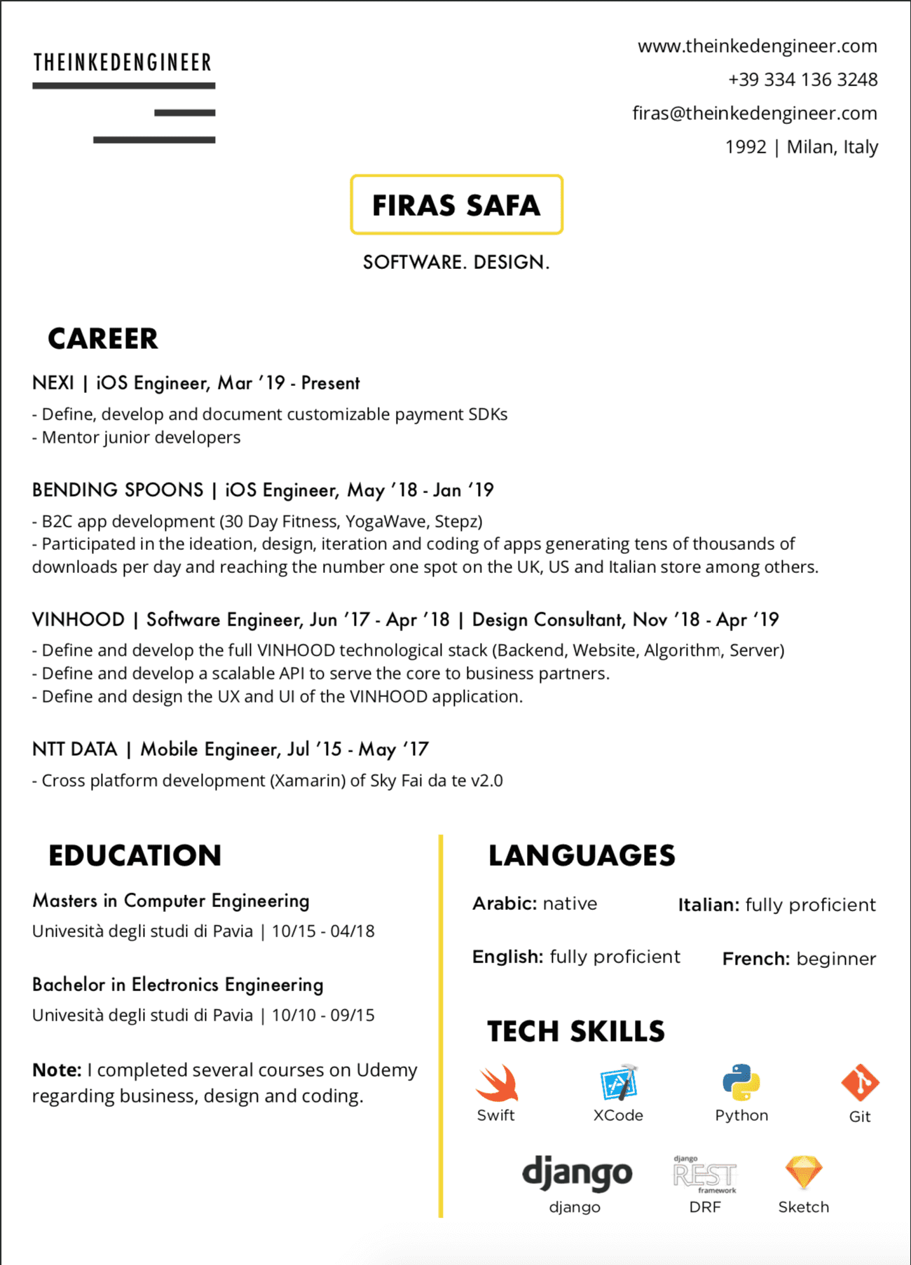
I changed the font to “Futura” for titles, and “Open Sans” for text.
Even MORE white space.
Layout
-
Used my name to divide the page at this point. With personal info in the top right corner, and the logo in top left corner as if it’s an invoice of some sort.
-
Education, Languages and Skills are not as important as the work experience so I extracted my career information from the vertical layout and had it on the top alone so it get all the main attention. And more room to breath since it is the section where the hiring manager will spend most of his time.
-
Got rid of the center layout and opted for a more classical, slightly left indented spacing.
Personal Information
I got rid of my picture. I am applying to software engineering jobs, my looks don’t really matter so there was no point in keeping the picture. It just takes up space, plus I am blond now (as of October 2019), so it does not really reflect my current looks, does it?
I got rid of my social media accounts but added back my website which now has a landing page with all my accounts. It just made more sense. Oh and I updated my logo, do you like it more?
Introduction
I got rid of the introduction. After more job interviews, no one really cares. Plus I almost always accompany my curriculum with a cover letter where I can actually explain the same points in a more detailed manner so there was no point in keeping it.
Career
Three main changes, other than the layout:
-
I merged my experiences by companies. I worked at VINHOOD at two separate occasions, in the previous version it created confusion for those reading my curriculum. Some even thought it was a typo so I merged both jobs in one.
-
I got rid of the tech stack used in each job because they will ask you about it again at the job interview so no reason really to include it.
-
In previous versions, I kept it general and always went for Software Engineer as a job title. I do believe I am a Software Engineer before anything else. Platforms change, languages change, etc.. But at the same time, I am now specialised in iOS Engineering so it made sense to define it in the job title itself.
Education
No changes.
Skills
No changes
Languages
No changes
TL;DR
- less is more. They won’t read your curriculum that long. Stick to what is important
- white space
- STOP USING CHARTS, STARS, PERCENTAGES and any other equivalent to represent your skills in a resume.